Is your website putting people off before they've even had a chance to look at the content? If you look at your analytics and your bounce rate is high - over 75% (for content other than blogs or contact pages - then your site might be falling foul of some of the issues below.
What visitor-repellants does your website have? And is it time to redevelop?
They don't know what you do
The first thing that a visitor sees when they land on your site - the 'hero' - should be pretty clear in terms of letting them know what to expect, what you do, and why they should care. I can't count the number of times I've looked at a site and realised I had no idea what the business was trying to sell me.
I've mocked up an example of a site I looked at recently - I'm not here to shame anyone, so it's got the same issues but is a vague representation rather than a direct copy. What do you think this brand is all about?
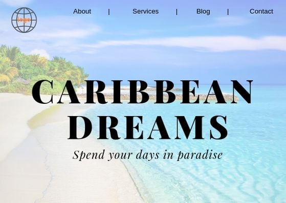
Holidays? Retiring to an island?
Would you have guessed it was a recruitment company? I didn't, and had I not been specifically looking at that website, I wouldn't have scrolled down to find out. I'd have assumed it was a holiday site, which wasn't what I wanted, and moved on to a competitor.
But your site doesn't even have to have this degree of confusion to be unhelpful to visitors. How about this example?
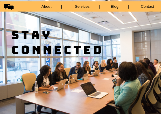
Would you know what the service offering was here? Conferencing facilities? Presentations? Educational software? What about if the content was more informative:
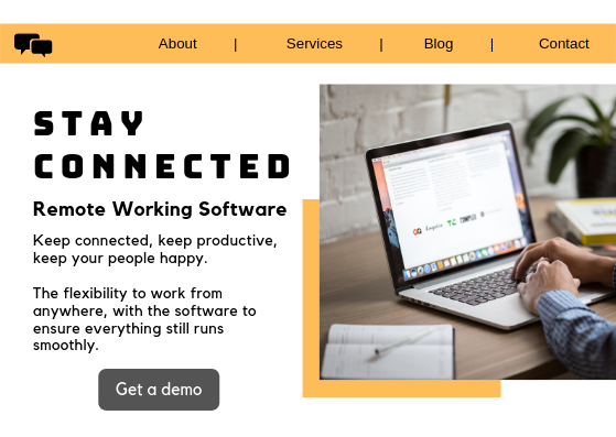
In this version, I know what the service actually is. I know what 'stay connected' refers to, and I know what the headline benefits are - much better. I now know whether or not this page is what I'm looking for, within seconds of me landing on it, rather than having to search around.
The easier you make it for your visitors to recognise what you do and, more importantly, why it matters to them, the more likely they are to stay on your site long enough for your awesome content to convert them into leads or customers.
It doesn't look right
Does your site look right? Does it match the expectations of your visitor? Do the images and content work together to properly explain your offering?
There are a surprising number of websites that just don't worry about this sort of thing. Their imagery is chosen fairly randomly from stock websites, the tone of voice hasn't ever been given much thought, and nothing quite hangs together.
Let's say you're a retail business, selling simple but good quality clothing with a minimalist look. Which of these website styles would make the most sense?


The first image showcases the brand values of being simple, sleek, and minimal. The second looks more like a vintage clothes shop - somewhere quirky, busy, and patterned. Image choice and font style make a massive difference to the perception of your brand. Neither of these examples is wrong in general terms, but the second is definitely wrong for the hypothetical brand we're talking about here.
If your website visitor is looking for a site that offers timeless, elegant clothing, they're not likely to stick around if they land on the second example - it doesn't match what they're expecting. They won't have time to find out if your products are actually what they're looking for because they'll have been put off by the style. Similarly, someone looking for fun, funky, inexpensive vintage clothes will probably avoid the first design - it doesn't match their needs, either.
You're throwing too much at them at once
Too many CTAs, too much information, too many words, too many pop ups. How often do you land on a web page that throws a full-screen pop-up over the content before you've even got to read the headline? Or the ones that ask you to allow browser notifications in one pop-up, while a live chat box springs up from the bottom of the screen, and maybe even the newsletter signup box comes swooping in at the same time.
Imagine if Google did this (which is sadly common on many sites):
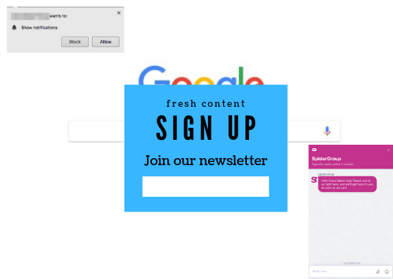
You can't actually do anything until you've given your attention to multiple items that don't actually reflect why you're on the site in the first place.
[I should note that our web chat, which I've used as an example in here, doesn't pop up automatically - it's there and easily accessible if/when people want to use it, rather than intruding on their experience.]
Your visitor hasn't even had chance to decide if your site is of interest to them and you're already demanding a lot of decisions. They've got no reason to make those decisions in your favour, because you haven't even given them a chance to like what you're offering them. Engagement starts with you giving them something worth engaging with, before requesting more access to them.
Marketing is most effective when you solve your customers' issues and pain points. You should be focused on what they need and what their goals are, not insisting they sign up to one thing, get in touch in another way, and let you bombard them with more content at will. In fact, given you've bombarded them within moments of them landing on your page, the likelihood that they'll trust you with their contact details is lessened.
Now, pop-ups are used because they are effective - we wouldn't be seeing them all over the internet if they weren't. But there's always a balance to be found. Don't throw them all at your site visitors the second they land on the page, be a little more patient. Wait for them to scroll a little before adding something in - and don't cover up the main content with it. Test different types of pop-ups, different triggers, and different CTAs to see what works best with your audience. Just be moderate and give your content and visitors time and space to breathe.
Information is hard to find
If a visitor has to click around your site multiple times to find the information they're searching for, they're likely to bounce away to a competitor. The more effort you ask of them, the less time they'll spend on your site.
This is another mockup of a site I looked at recently - again, it's anonymised, but the menu contains exactly the same structure, number of elements, and types of content as this particular site:

That's a lot of menus for one site. Especially as the second line makes it appear that there are only a couple of products. In fact, if you hover over 'products' in the top menu, you'll find another menu with 20-odd products on it. Presumably the two mentioned by name on line 2 are the priority products, but it's easy for a visitor to assume those are the only ones available.
The download doesn't take you to a resources page with downloadable content for all products or services, it takes you to one individual PDF. But you can download the specifications for each individual product, you just have to go to that product, find a section of the page that is in a different place each time, and click through to an additional page in order to download the content. Far, far too much effort.
In this particular case, as well as many, many other websites, I get no guidance for what I might need. Sure, I could know that I need a specific product, but if I'm in the process of researching what I need, I'm more likely to be looking for a solution to a specific problem.
If your site only talks about the products or services you offer, you're making your visitor do all the work in matching your offering to their requirements. If they don't know exactly what they need, they're not going to stick around on a site that doesn't help them. They'll find somewhere that gives them a quiz, or explains 'this is perfect for x situation' or even asks 'looking for a solution to x problem'?
Get into your audience's mindset. What are they looking for? How can you make it as easy as possible for them to find it?
It takes too long
If your site takes too long to load, say goodbye to a huge number of your visitors. Site performance has a massive impact on user experience, user engagement, and conversions, not to mention limiting your attempts to improve your SEO.
According to research, 47% of consumers expect a web page to load in 2 seconds or less. And Google found that 53% of mobile users simply leave a site that takes more than 3 seconds to load. Incidentally, this figure has been on the rise over the last few years, so page speed will likely need to get faster and faster to satisfy modern consumers, especially for mobile users.
Conversion rates also take a hit when your site takes too long - if a customer has to wait too long to actually convert, they'll just leave. It's not an insignificant drop, either - the conversion rates fall precipitously from the 1-2 second mark.
.png?width=1024&name=Page%20load%20time%20(seconds).png)
What elements of your site might be slowing you down? There are loads of things that can affect your site loading speed, but these are ones you should tackle first:
- Page size too large
- Images too large and need optimising
- Server response time too slow
- Too many HTTP requests
- Too many redirects
- No compression included
- HTML not minified
Ultimately, you need to make your website a pleasant, simple, informative place for your visitors, otherwise they'll simply move on to somewhere else that does give them what they need. If you're not convinced, check out our web design myths debunked post.
If you're now thinking about giving your site a little bit of a makeover, we are a Bristol based web design agency. Either give us a call, click the button below, or check out our guide to how much a website should cost. Either way, it's time to make your site better for your users.